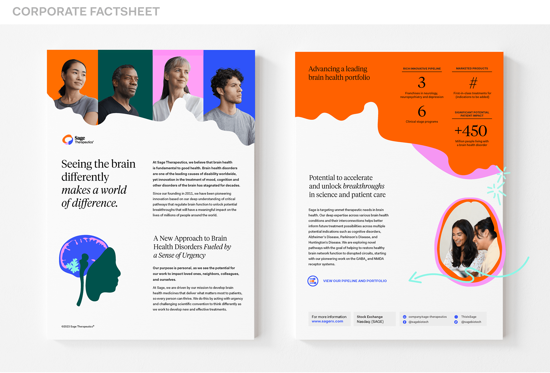
Together with the Director of Corporate Branding and Graphic design, I was responsible for fostering brand cohesion, maintaining strict adherence to brand guidelines with external partners, and collaborating seamlessly with stakeholders throughout the organization to consistently deliver assets aligned with our brand identity.
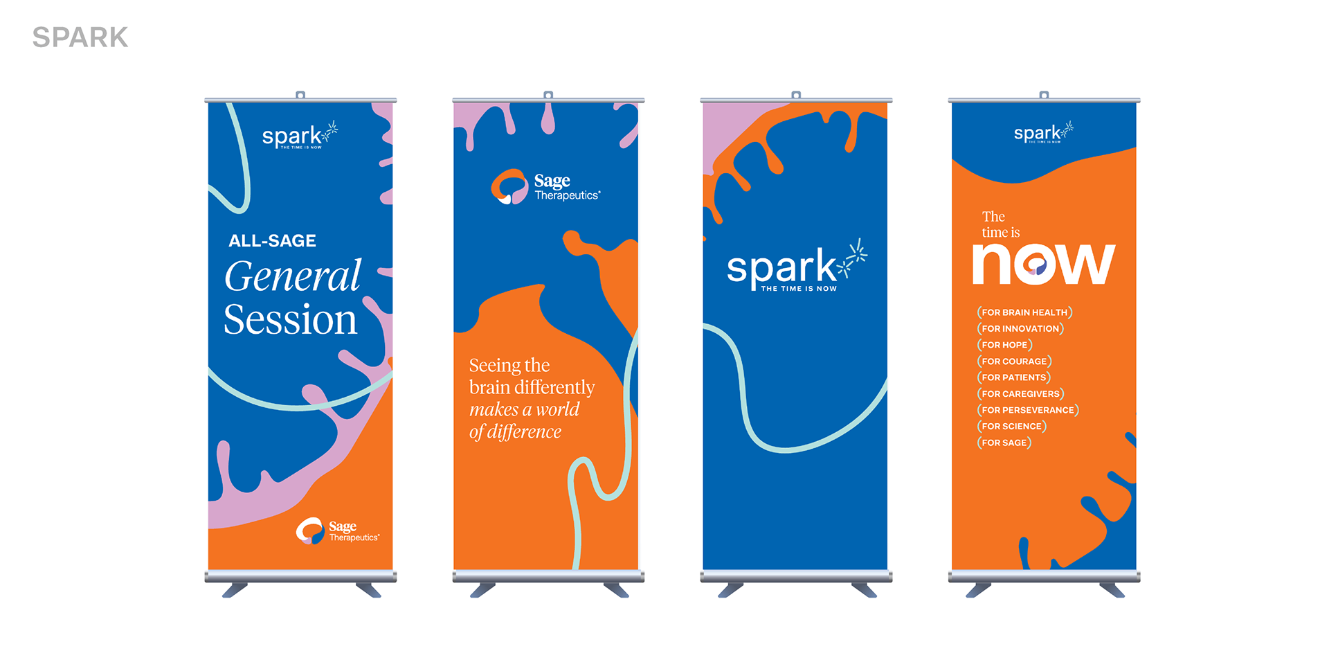
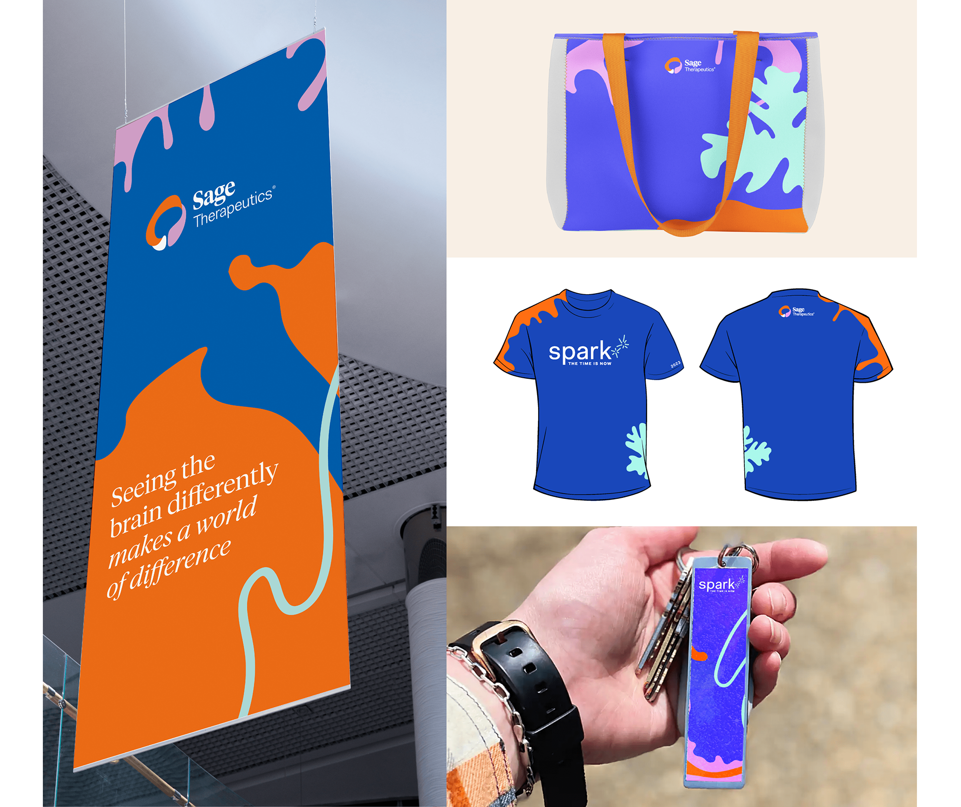
Spark is a company-wide event to gather employees for team building exercises once a year. I worked to develop the look and feel of the event - everything from signage to swag.
Marks were created for initiatives to allow internal teams a bit more individuality. A system was created to allow these marks to work with the Sage brand mark, without overwhelming it. I worked directly with teams of stakeholders to create, revise, and finalize guidelines for each mark.
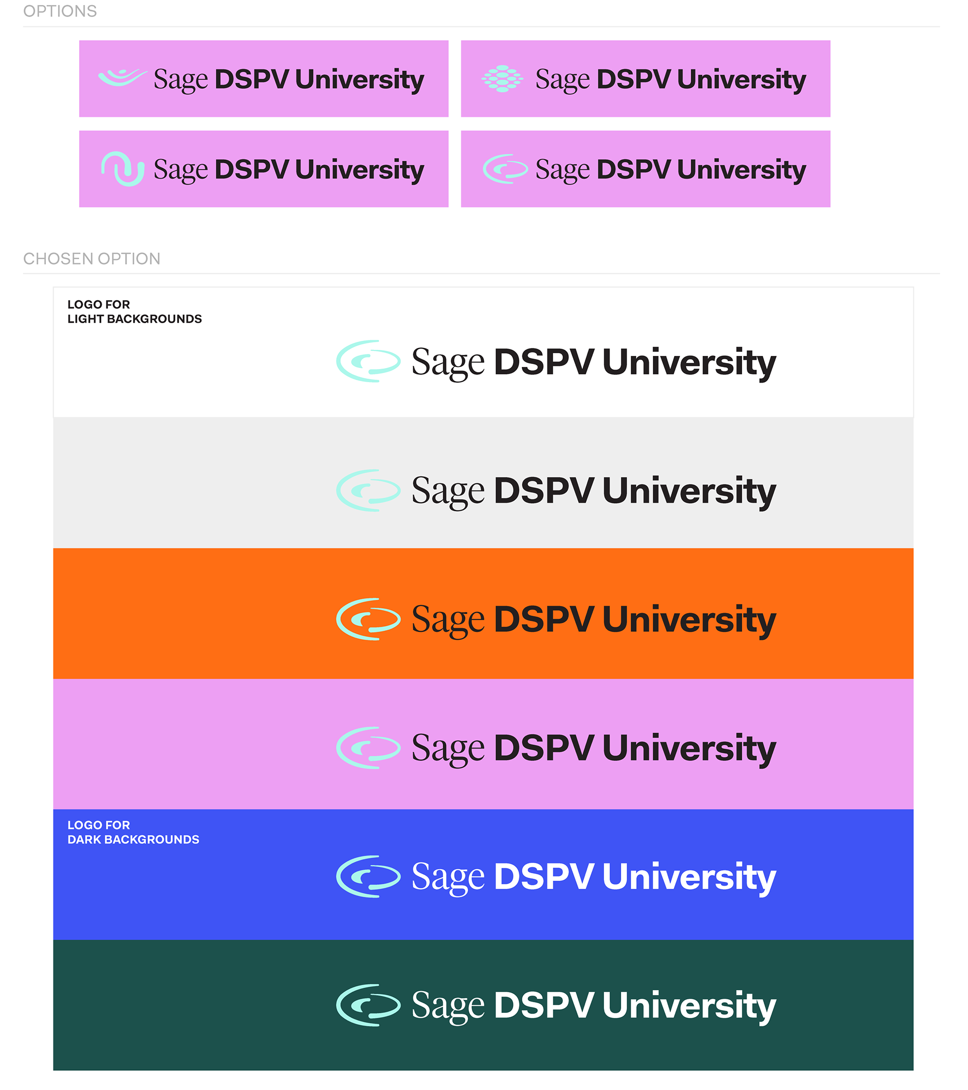
RATIONALE BEHIND MARK: This mark combines connectivity and the pill shape commonly associated with DSPV. We allowed these concepts to be abstract, and guide the eye through an open pathway for connectivity and training.
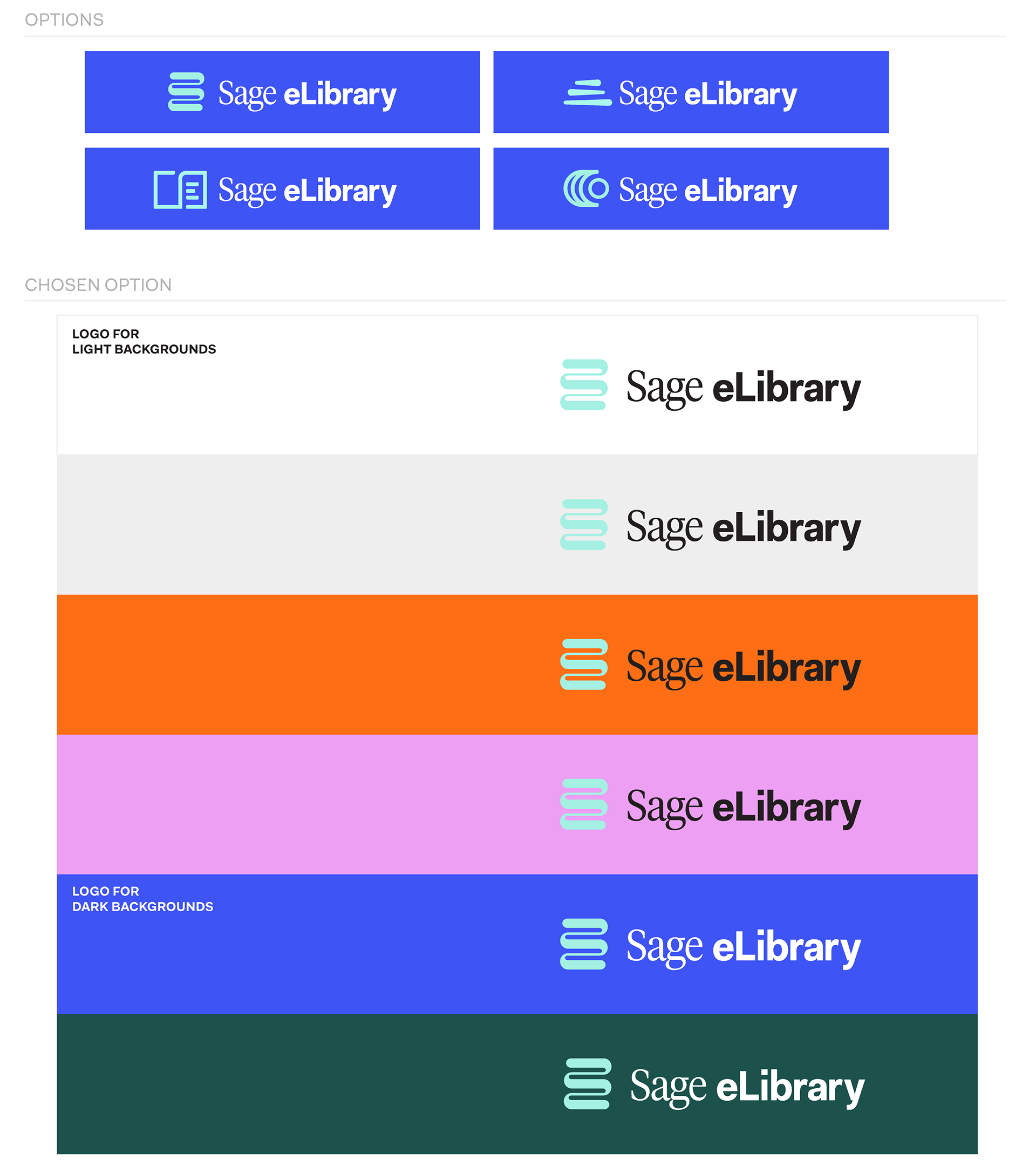
RATIONALE BEHIND MARK: This mark is focused on a modern depiction of stacked books. The connected weave alludes to the connected library resources readily available, and the mark creates an abstract “E” for eLibrary.